

Launching a marketing campaign on the web means fighting two successive battles: the first is to make sure that visitors who receive the advertisement click on the link. The second, and probably the most important, is to push these visitors to complete the action that concludes your landing page. In this practical guide, Twilead provides you with professional advice as well as the mistakes to avoid in order to build a landing page that converts in no time, without any headaches!
What is a landing page?
The landing page is a “stand-alone” web page created specifically to support a particular marketing campaign. This is the page where prospects will land after clicking on a link in an email, an ad on a search engine (Google and Bing in particular), an ad on a video platform (YouTube), an ad on social networks (Instagram, Twitter, Facebook, LinkedIn…), a link on an SMS, etc.
Unlike traditional web pages that encourage the exploration of the website or the reading of a content until the end, landing pages are designed to serve a single purpose, symbolized by the Click to Action (or CTA). In a web teeming with stimuli, the landing page focuses all content and design on the targeted action to promote conversion.
In the marketing funnel, the landing page is located at the bottom, just before the check-out if the expected action is transactional, registration for an event, booking a product demo, etc.
Note: on Google Ads or Google Analytics, the expression “landing page” is used to define all the web pages of a website. In the language of digital marketing, the expression refers to the pivotal page of a marketing campaign with a single Call to Action (CTA) and little or no possibility of navigation on the rest of the website.
The 6 main families of landing pages (and examples)
To help you make an informed choice, we have compiled the 6 main families of landing pages. What does each type consist of? What is the objective? What are the key success factors? Find also some examples to inspire you!
#1 The “Squeeze” landing page
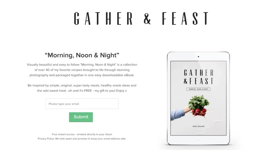
This is probably the page that comes to mind for any marketer when they hear about a landing page. It is a simple page composed of three elements: a title that summarizes the offer proposed to the visitor, the details of the added value of the offer and a relatively short form to capture or “squeeze” the contact information of the visitor, including his email address and possibly his phone number. Submitting the form usually allows the lead to benefit from the promise right away (free trial of a solution, download of a white paper or ebook, etc.).
Note: the pop-up and the sticky bar have the same objective, which is to encourage the visitor to give his contact information in exchange for a content or a service. However, they are not “squeeze” landing pages for a simple reason: they try to convert existing traffic, unlike landing pages that welcome visitors who have clicked on a link from a source external to the page.
Here is a concrete example of a successful “squeeze” landing page. As you can see, the contact form is reduced to a single field, the email address. The reward is clearly explained, and the copywriting is both simple and elegant. Objective: limit distractions so as not to lose the visitor’s attention.
#2 The mega-landing page (or long form landing page)
This is a large landing page that stands on its own. Although it welcomes visitors who have shown some interest in the offer on an external source (social networks, search engines…), this landing page addresses them as if they were at the beginning of their buying journey. Concretely, the content of this page is built in a logic that resembles the Inbound, since we will first try to capture the visitor’s attention with an eloquent fact, an astonishing figure, a curious observation or a problem that complicates the life of the visitor. Afterwards, a long commercial argument is developed with the help of a high-flying copywriting.
The product promise is repeated, rephrased and paraphrased in catchy (sometimes racy) terms to anchor the message in the reader’s memory. The tone adopted is very committed, passionate and emotional. The FOMO technique, or ” Fear of missing out “, is often used to create a sense of urgency and/or scarcity. Overall, this landing page mobilizes several sales techniques in its visual design and text. It is not uncommon to find mega-landing pages of over 7,000 words! We will find in particular:
- Storytelling elements, especially at the beginning;
- A long development of the problem that the commercialized product allows to solve;
- Testimonials from satisfied customers. This is called Social Proof;
- Expert testimonials that explain how the product marketed is different from the competition;
- Many illustrative images and videos;
- Promotion;
- An “FAQ” section;
- Guarantees to remove any remaining objections or misgivings;
- Possibly a Live Chat (human or chatbot), etc.
These landing pages generally do not allow you to navigate the site, if it exists at all. The only link offered is to the payment page. Here is an example of this type of landing page.
#3 Splash landing pages
Unlike other landing pages that welcome the visitor from an external source or from another page on the same website, splash landing pages generally appear before all pages on the website to qualify the visitor before allowing them to explore the site. The purpose of the Splash page is, for example, to verify the visitor’s age, to ask about language preferences, or to inform them about an upcoming event.
Typically, the Splash page contains very little text… just enough to get a message across or a response. Here is an example to confirm the age of the visitor (Budweiser).

#4 The Lead Gen landing page
This is probably the most used type of landing page on the web, as it offers a good compromise between the squeeze and the mega landing page. Versatile, relatively simple to implement and quite effective, the Lead Gen landing page is generally used in the middle part of the marketing funnel to qualify visitors and collect their contact data. Typically, the contact form will be positioned on one side of the page, with the rest reserved for the promise or reward.
Note: if you’re offering mid-funnel content like a white paper or ebook, opt for a short contact form. If visitors are more towards the bottom of the marketing funnel (requesting a demo or making an appointment), you can afford a longer form to allow your sales team to better qualify the prospect and prepare their appointment. Here is an example from Monday, a project management tool.

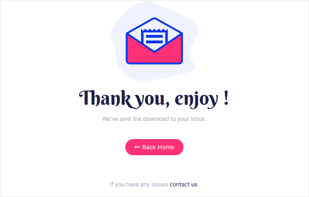
#5 The thank you landing page
The thank you landing page is used to thank visitors for completing the action but also to confirm that the form has been submitted, that their order has been processed, etc. Usually, the thank you landing page is displayed simultaneously with the confirmation email.
This type of landing page can have several objectives: to move the prospect through the marketing funnel, to contribute to customer loyalty with a personalized message, to do cross-selling by recommending products that are complementary to their purchase, to remind them of a sponsorship or loyalty program, to propose a short satisfaction survey on the ease of the order, to reassure them of their purchase decision, etc.
#6 The “404” landing page
Technically, the “404” error pages are landing pages, in that they welcome potentially lost visitors to push them to perform an action: visit a “functional” page of the website. A good 404 landing page must be consistent with your graphic charter, with a message in line with your positioning.
Many brands play the humor and lightness card to play down the error or technical problem. Some even opt for an interactive element, with a mini-game or an animation. The IMDB example is a textbook case, with quotes from famous films hijacked on the theme of the 404 error.

5 golden rules for a landing page that converts
So yes, there is no magic formula to develop a landing page that converts en masse. However, there are a few criteria that are found in all landing pages that outperform. Here are 5 of them.
#1 The “H1” title and the “meta title”: two crucial factors
The meta title and meta description of your landing page play an essential role if you are counting on visitors coming from search engines. These two elements will indeed be the only showcase of the landing page before clicking.
So be sure to include them in your copywriting effort. The H1 title will be the first element read by the visitor once he lands on the landing page. A tip: write it at the very end of your copywriting effort. Having produced all the content on the page will allow you to avoid a disappointing H1 title, whose promise is not fulfilled afterwards. Also, leaving the title creation to the end allows you to draw inspiration from the best punchlines in your content.
#2 A human live chat or a chatbot
One statistic will convince you to integrate a Live Chat in your landing page. According to a study by Shoppop, landing pages that include a Live Chat convert up to four times more than others. Is there a need for further development?
#3 Thank you page is not an option
Once visitors have filled out the contact form and clicked on the CTA, you need to thank them and possibly move them along the buying journey to take advantage of cross-selling opportunities, for example. The thank you page will also allow them to receive a formal confirmation of the completion of the action. Make them feel valued… a first step to building trust and loyalty.
#4 Test & Learn, the secret of a great landing page
What works for one company, industry, target or market may not work in another configuration. Don’t settle for a template downloaded from an English website. Try to adapt your landing page to your buyer persona and your brand image. Don’t hesitate to do internal testing, on a panel of loyal customers, or even A/B testing on a small sample. In short, activate the power of Data to build a formidable landing page!
#5 Secure your contact form with a validation solution
Equip your contact form with a real-time validation solution, especially on important fields like email and phone number, if applicable. These solutions check in real time the conformity of the input to the expected format and save you from draft databases with erroneous entries. Also, we advise you to limit your form to the strict minimum so as not to discourage visitors. For example, do you really need to know how the visitor came to know your website?
3 fatal mistakes that ruin your landing pages (and your campaigns)
If your landing page has any of the following three mistakes, it will not only compromise the conversion rate, but the profitability of the entire marketing campaign.
#1 A landing page not optimized for mobile
According to the latest figures from Médiamétrie, France has more than 53 million monthly Internet users… including 37.4 million who surf the web from a cell phone. All in all, nearly 71% of French Internet users connect from their smartphone. Displaying a landing page not optimized for mobile is simply shooting yourself in the foot. Also note that Google tends to penalize websites that do not offer a smooth experience on mobile. Your visibility will therefore take a (big) hit. No, a landing page not optimized for mobile is not an option!
#2 An abnormally long loading time
It’s simple: according to Google, a page that takes one to three seconds to load will lose 32% of visitors. A page that takes one to five seconds to load will lose 90% of visitors 5 Of course, creating a good landing page requires an artistic effort, with punchy content, beautifully crafted visuals, videos, UX, persuasive techniques, etc. But if the technical standards are not met (poor quality server), all your efforts will be for nothing.
#3 One landing page for multiple campaigns
Don’t succumb to the easy way out: I spend time and energy creating a beautiful landing page to showcase an offer and speed up conversion. This landing page is quite successful. I want to launch a new campaign, with a similar product. Rather than creating a new landing page, I simply add a block to the previous landing page. No !
Sure, you’ll save a little time, but the results can be catastrophic. Already, you will have a hard time distinguishing the conversion rate and other KPIs of each campaign. Then, a good landing page should not be modified, at the risk of seeing its performance drop. According to HubSpot, companies that create more than 40 landing pages (so one landing page per campaign) receive 12 times more leads than companies that create less than 5.
Twilead, the all-in-one marketing platform that puts your marketing in orbit
In developing Twilead, we wanted to offer companies a unique, all-in-one platform that combines the best marketing, sales and CRM features. The goal is to allow companies to boost their conversion rate and develop their business from the first month.
Twilead offers lead generation and marketing automation tools, including the ability to create landing pages, sales funnels, forms and surveys. Twilead also offers sales pipelines and calendars, unlimited contact management (CRM) and tools to boost your e-reputation. Book your demo now!